
반응형
Recent Posts
Recent Comments
Link
| 일 | 월 | 화 | 수 | 목 | 금 | 토 |
|---|---|---|---|---|---|---|
| 1 | 2 | 3 | 4 | 5 | 6 | |
| 7 | 8 | 9 | 10 | 11 | 12 | 13 |
| 14 | 15 | 16 | 17 | 18 | 19 | 20 |
| 21 | 22 | 23 | 24 | 25 | 26 | 27 |
| 28 | 29 | 30 | 31 |
Tags
- Weekly Challenge
- nextjs
- React
- array
- javascript
- 리액트
- javscript
- 폼
- MaterialUI
- component
- level1
- HTML
- From
- Challenge
- algorithm
- 알고리즘
- redux-toolkit
- Weekly
- solution
- 직업군 추천하기
- 상호 평가
- programmers
- Prettier
- split
- eslint
- js
- Collapse
- next
- Javasript
- form
Archives
- Today
- Total
기록
React Antd CollapseForm 검색 컴포넌트(2) 본문
서론
이전 포스트에 이어서 기간을 선택하는 컴포넌트와 셀렉트 박스 컴포넌트를 만들어본다.
FormDateRange 컴포넌트
src/enum/DateRange.ts
enum으로 기간 선택 시 오늘 최근 7일 한 달을 선택하기 위한 enum과 버튼 텍스트를 반환하는 함수를 만든다.
export enum DateRange {
  ALL = 'ALL',
  TODAY = 'TODAY',
  RECENT_WEEK = 'RECENT_WEEK',
  RECENT_MONTH = 'RECENT_MONTH'
}

export const DateRangeMethods = {
  getLabel: (key: string) => {
    switch (key) {
      case DateRange.ALL:
        return '전체';
      case DateRange.TODAY:
        return '오늘';
      case DateRange.RECENT_WEEK:
        return '최근 7일';
      case DateRange.RECENT_MONTH:
        return '최근 30일';
      default:
        return '';
    }
  }
};
src/component/Form/FormDateRange/index.tsx
form인스턴스 등 이전 컴포넌트와 다를 것 없이 만들었다.
다른 점은 handleChangeShortcut 함수로 버 오늘, 7일, 30일, 전체 버튼 클릭 시 기간이 설정되게 했다.
버튼 안에 들어가는 텍스트들과 함수의 인자 값은 만들어둔 enum을 사용하였다.
import { Form, DatePicker, FormItemProps, Button, FormInstance } from "antd";
import { DateRange, DateRangeMethods } from "enum";
import moment from "moment";
import styled from "styled-components";

const { RangePicker } = DatePicker;

const StyledFormDateRange = styled(Form.Item)`
  .ant-btn {
    width: 90px;
    height: 32px;
  }
`;

interface FormDateRangeProps extends FormItemProps {
  form: FormInstance;
}
export const FormDateRange = (props: FormDateRangeProps) => {
  const { form, name, ...rest } = props;

  const handleChangeShortcut = (key: DateRange) => {
    let started = moment().startOf("days");
    const ended = moment().endOf("days");

    switch (key) {
      case DateRange.TODAY:
        started.subtract(0, "days");
        break;

      case DateRange.RECENT_WEEK:
        started.subtract(7, "days");
        break;

      case DateRange.ALL:
        started = moment("2020-01-01");
        break;

      case DateRange.RECENT_MONTH:
        started.subtract(1, "months");
        break;
      default:
        break;
    }
    form.setFieldsValue({
      [`${name}`]: [started, ended],
    });
  };

  return (
    <StyledFormDateRange {...rest}>
      <Form.Item name={name} noStyle>
        <RangePicker
          onChange={(e) => console.log(e)}
          placeholder={["시작일", "종료일"]}
        />
      </Form.Item>
      <Button onClick={() => handleChangeShortcut(DateRange.TODAY)}>
        {DateRangeMethods.getLabel(DateRange.TODAY)}
      </Button>
      <Button onClick={() => handleChangeShortcut(DateRange.RECENT_WEEK)}>
        {DateRangeMethods.getLabel(DateRange.RECENT_WEEK)}
      </Button>
      <Button onClick={() => handleChangeShortcut(DateRange.RECENT_MONTH)}>
        {DateRangeMethods.getLabel(DateRange.RECENT_MONTH)}
      </Button>
      <Button onClick={() => handleChangeShortcut(DateRange.ALL)}>
        {DateRangeMethods.getLabel(DateRange.ALL)}
      </Button>
    </StyledFormDateRange>
  );
};
App.tsx에 적용
src/App.tsx
import { Layout, Form } from "antd";
import {
CollapseSearchForm,
FormCheckBox,
FormInput,
FormDateRange,
} from "component";
import styled from "styled-components";
const { Content } = Layout;
const StyledApp = styled(Layout)`
left: 0;
right: 0;
margin: 0 auto;
width: 750px;
height: 100vh;
`;
const App = () => {
const [form] = Form.useForm();
const storeStatusOptions = [
{ label: "신청", value: "APPLY" },
{ label: "심사", value: "JUDGE" },
{ label: "보류", value: "HOLD" },
{ label: "승인", value: "OKAY" },
{ label: "해지", value: "TERMINATION" },
{ label: "수정요청", value: "MODIFYINFO" },
];
const storeDivisionOptions = [
{ label: "개인", value: "individual" },
{ label: "법인", value: "corporation" },
];
return (
<StyledApp>
<Content>
<CollapseSearchForm
form={form}
detail={
<>
<FormInput
label="전화번호"
colon={false}
labelCol={{ span: 4 }}
labelAlign="left"
inputProps={{ placeholder: "전화번호를 입력해주세요" }}
></FormInput>
<FormCheckBox
label="가맹점 구분"
circle
form={form}
name="storeDivision"
labelAlign="left"
labelCol={{ span: 4 }}
colon={false}
option={storeDivisionOptions}
></FormCheckBox>
</>
}
>
<FormInput
label="가맹점"
colon={false}
labelCol={{ span: 4 }}
labelAlign="left"
inputProps={{ placeholder: "가맹점을 입력해주세요" }}
></FormInput>
<FormCheckBox
form={form}
label="가맹점 처리상태"
name="storeStatus"
labelAlign="left"
labelCol={{ span: 4 }}
colon={false}
option={storeStatusOptions}
></FormCheckBox>
<FormDateRange
name="createdDate"
form={form}
label="등록일자"
labelCol={{ span: 4 }}
labelAlign="left"
colon={false}
></FormDateRange>
</CollapseSearchForm>
</Content>
</StyledApp>
);
};
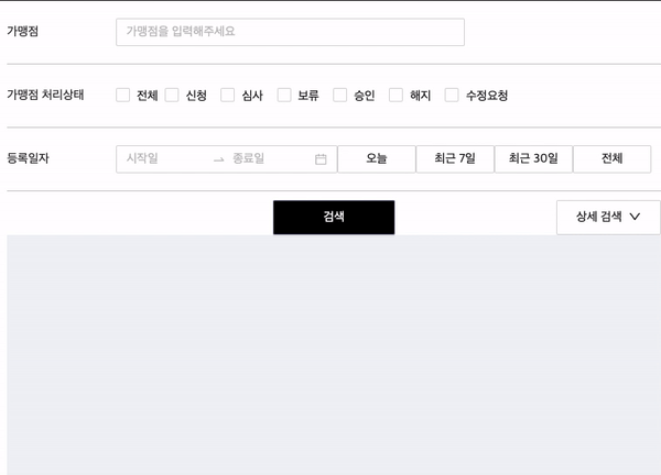
export default App;실행

FormSelect 컴포넌트
src/component/Form/FormSelect/index.tsx
이 컴포넌트도 다른 컴포넌트와 마찬가지로 만들었다. 받아온 option 값으로 선택할 수 있는 값들을 생성해 주었다.
import { FormItemProps, Select } from "antd";
import { Form } from "antd";
import styled from "styled-components";

const StyledFormSelect = styled(Form.Item)`
  width: 100%;

  .ant-select {
    width: 180px;
  }
`;

interface FormSelectProps extends FormItemProps {
  option: { title: string; value: string }[];
}
const { Option } = Select;

export const FormSelect = (props: FormSelectProps) => {
  const { option, ...rest } = props;
  return (
    <StyledFormSelect {...rest} initialValue={"all"}>
      <Select>
        {option.map((arr, idx) => (
          <Option key={idx} value={arr.value}>
            {arr.title}
          </Option>
        ))}
      </Select>
    </StyledFormSelect>
  );
};
App.tsx
src/App.tsx
import { Layout, Form } from "antd";
import {
  CollapseSearchForm,
  FormCheckBox,
  FormInput,
  FormDateRange,
} from "component";
import { FormSelect } from "component/Form/FormSelect";
import styled from "styled-components";

const { Content } = Layout;

const StyledApp = styled(Layout)`
  left: 0;
  right: 0;
  margin: 0 auto;
  width: 750px;
  height: 100vh;
`;

const App = () => {
  const [form] = Form.useForm();
  const storeStatusOptions = [
    { label: "신청", value: "APPLY" },
    { label: "심사", value: "JUDGE" },
    { label: "보류", value: "HOLD" },
    { label: "승인", value: "OKAY" },
    { label: "해지", value: "TERMINATION" },
    { label: "수정요청", value: "MODIFYINFO" },
  ];

  const storeDivisionOptions = [
    { label: "개인", value: "individual" },
    { label: "법인", value: "corporation" },
  ];

  const areaOptions = [
    {
      title: "서울",
      value: "seoul",
    },
    {
      title: "부산",
      value: "busan",
    },
    {
      title: "전체",
      value: "all",
    },
  ];

  return (
    <StyledApp>
      <Content>
        <CollapseSearchForm
          form={form}
          detail={
            <>
              <FormInput
                label="전화번호"
                colon={false}
                labelCol={{ span: 4 }}
                labelAlign="left"
                inputProps={{ placeholder: "전화번호를 입력해주세요" }}
              ></FormInput>
              <FormCheckBox
                label="가맹점 구분"
                circle
                form={form}
                name="storeDivision"
                labelAlign="left"
                labelCol={{ span: 4 }}
                colon={false}
                option={storeDivisionOptions}
              ></FormCheckBox>
              <FormSelect
                name="area"
                label="지역"
                labelCol={{ span: 4 }}
                colon={false}
                labelAlign="left"
                option={areaOptions}
              ></FormSelect>
            </>
          }
        >
          <FormInput
            label="가맹점"
            colon={false}
            labelCol={{ span: 4 }}
            labelAlign="left"
            inputProps={{ placeholder: "가맹점을 입력해주세요" }}
          ></FormInput>
          <FormCheckBox
            form={form}
            label="가맹점 처리상태"
            name="storeStatus"
            labelAlign="left"
            labelCol={{ span: 4 }}
            colon={false}
            option={storeStatusOptions}
          ></FormCheckBox>
          <FormDateRange
            name="createdDate"
            form={form}
            label="등록일자"
            labelCol={{ span: 4 }}
            labelAlign="left"
            colon={false}
          ></FormDateRange>
        </CollapseSearchForm>
      </Content>
    </StyledApp>
  );
};

export default App;
실행
마치며
이상으로 상세 검색이 있는 검색폼을 폼 하나하나 나누어서 만들어봤다.
최대한 다른 폼에서도 사용할수있게 만들기 위해 이런 방식으로 만들었는데 더 좋은 방법이 없는지 생각해봐야겠다.
반응형
'React' 카테고리의 다른 글
| React Antd CollapseForm 검색 컴포넌트(1) (0) | 2021.07.28 |
|---|---|
| useState, useEffect (0) | 2021.06.03 |
| state, props (0) | 2021.06.03 |
| 함수 컴포넌트, 클래스 컴포넌트 (0) | 2021.06.03 |
| Simple Collapse (0) | 2021.06.03 |
'React' Related Articles
more


Comments